Los Angeles design lives at the meeting point of light and ease. The city's best rooms treat walls the way it treats its afternoons: sun-washed, relaxed, and quietly confident.
What LA style actually means on a wall
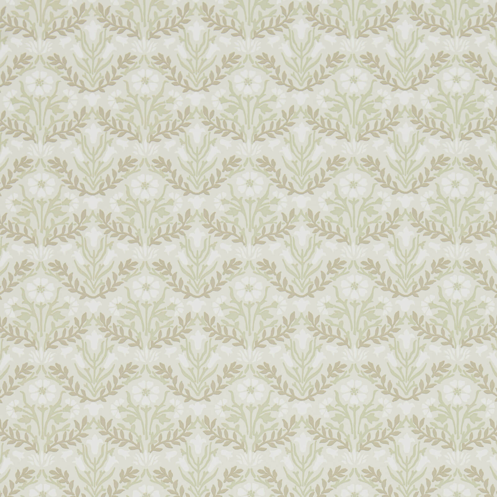
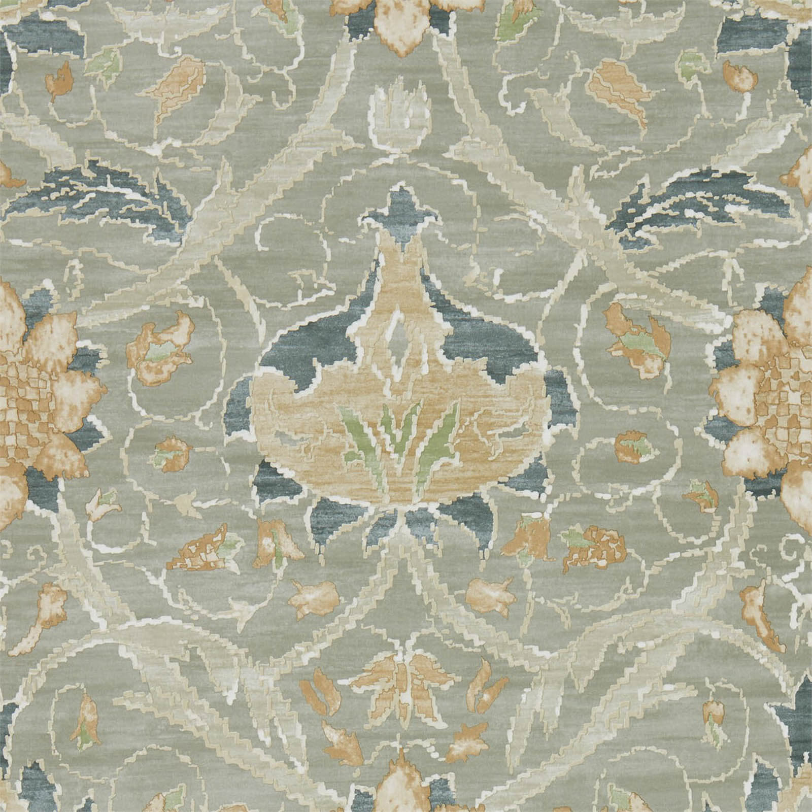
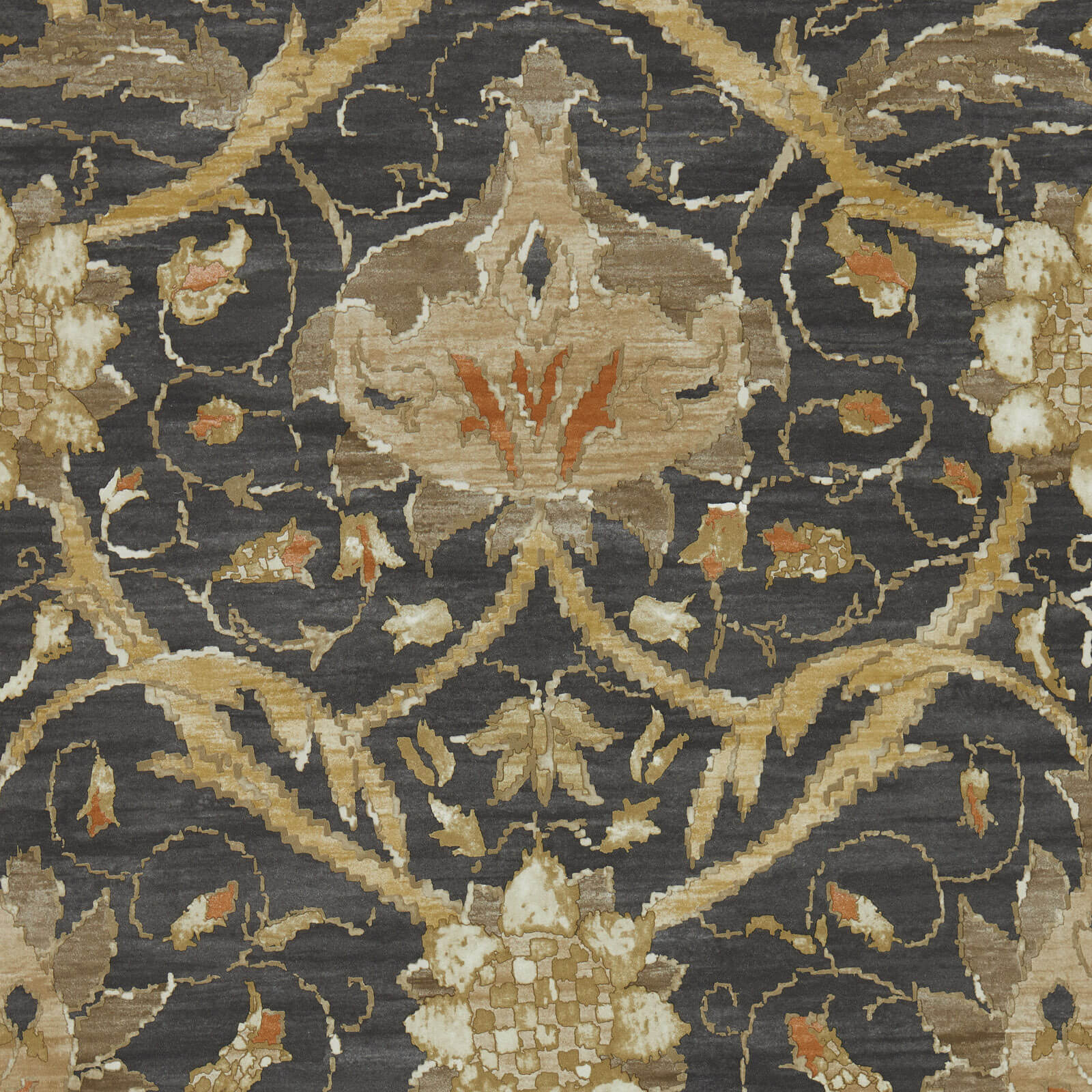
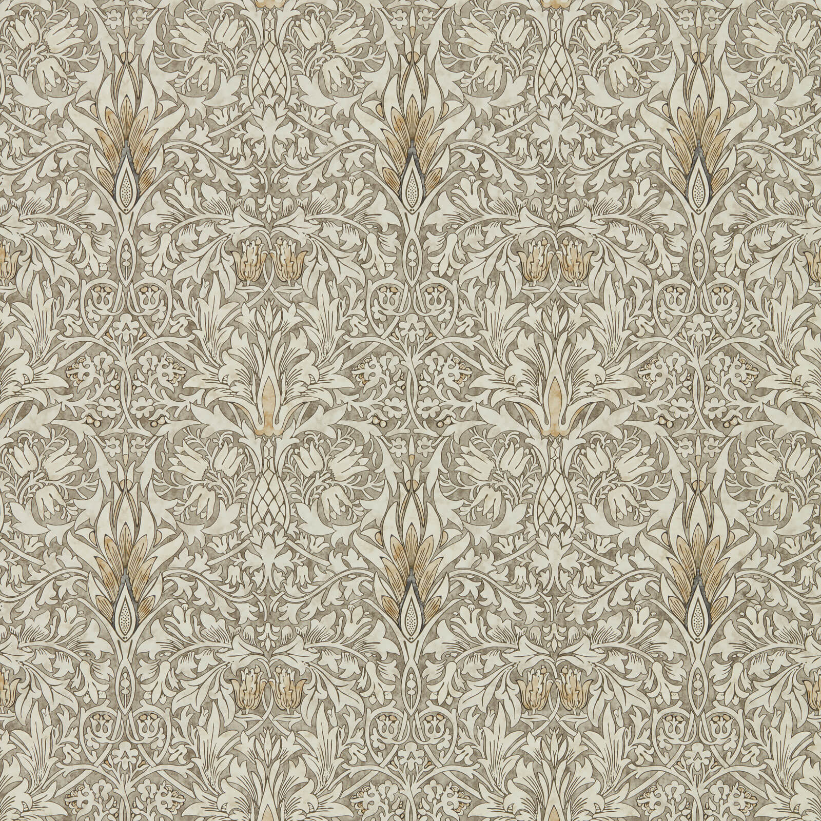
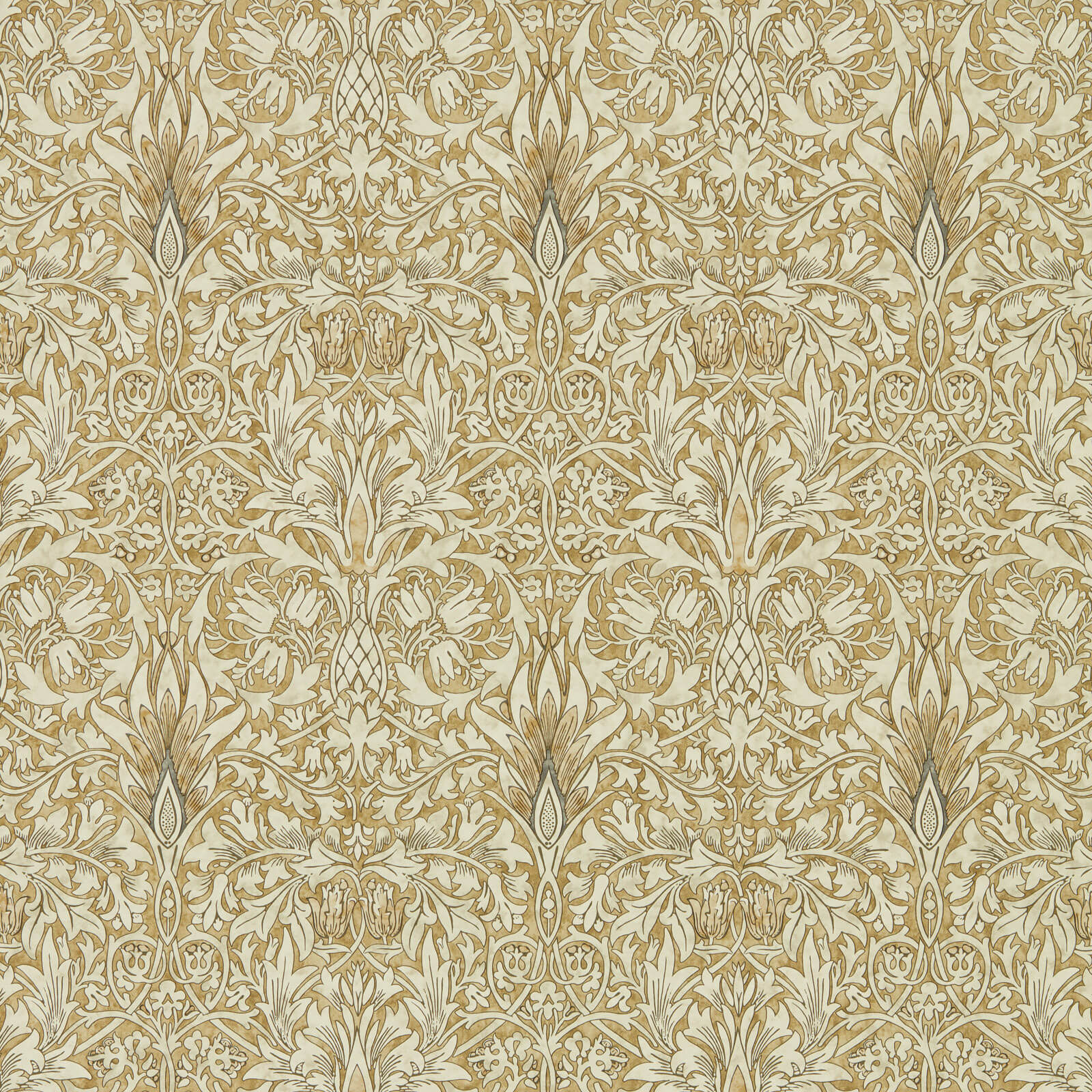
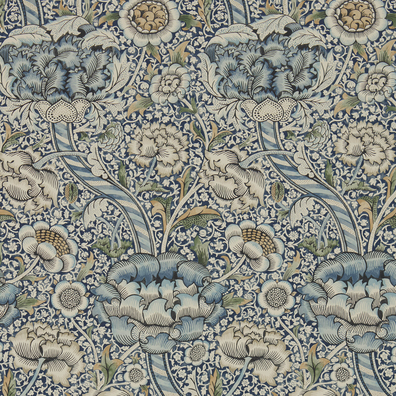
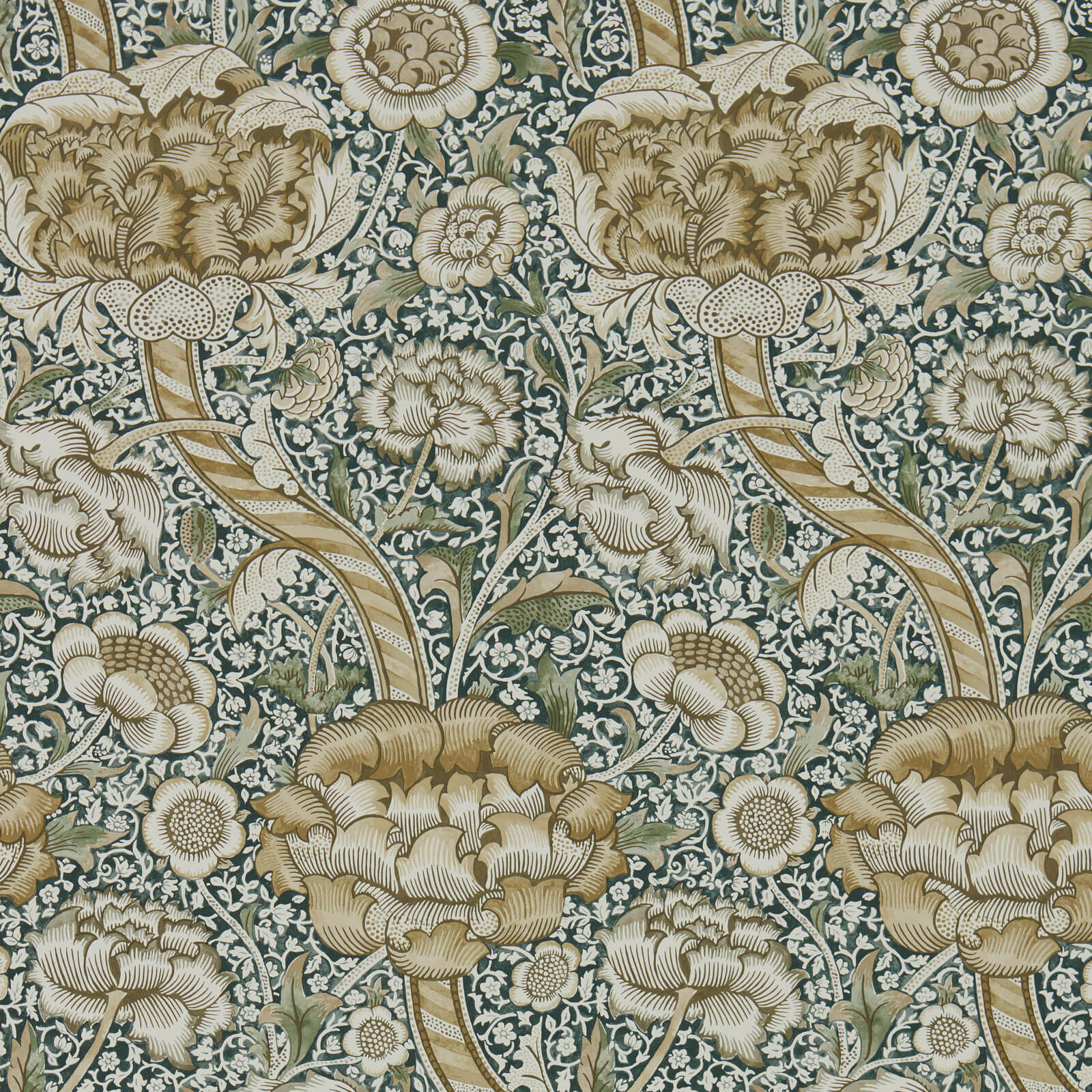
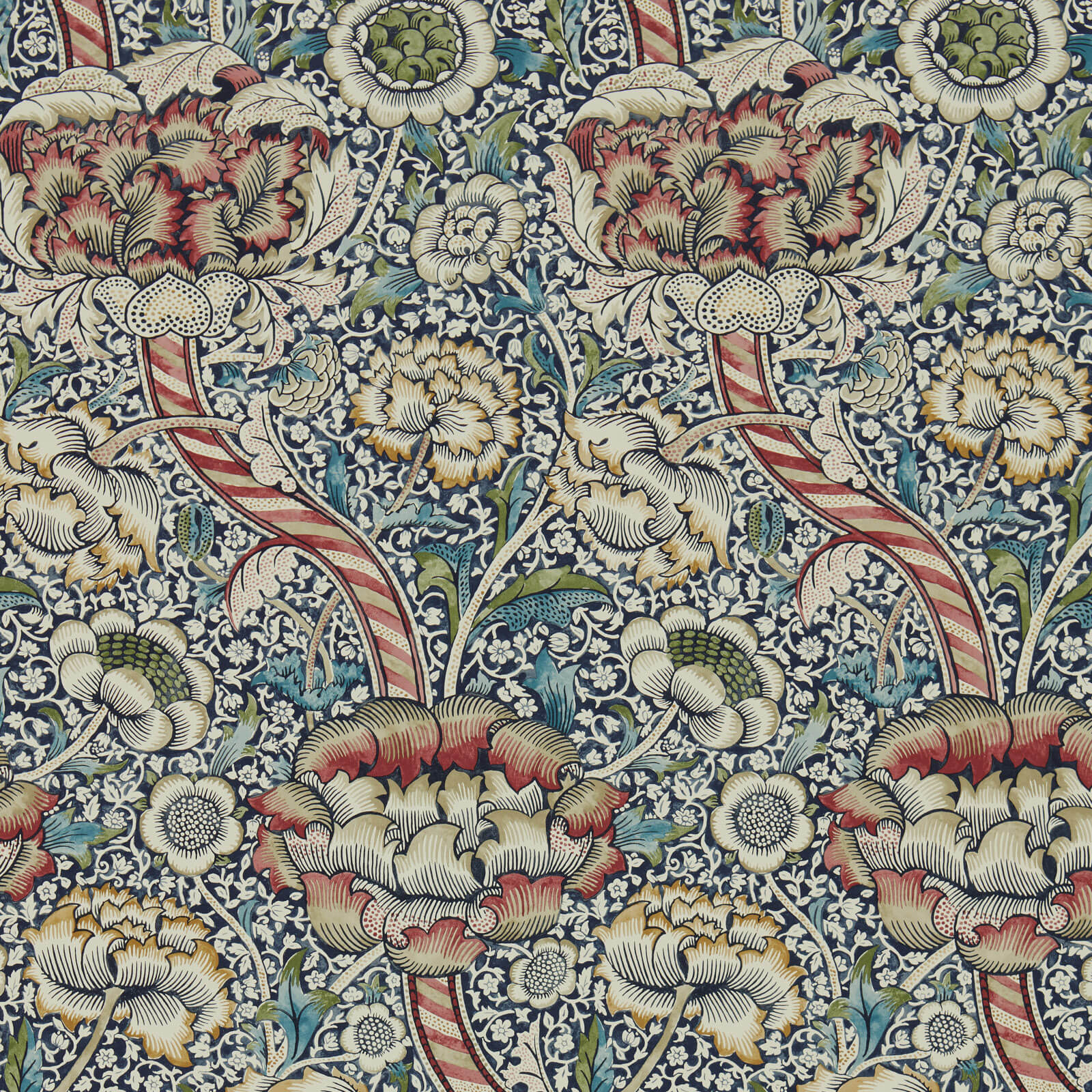
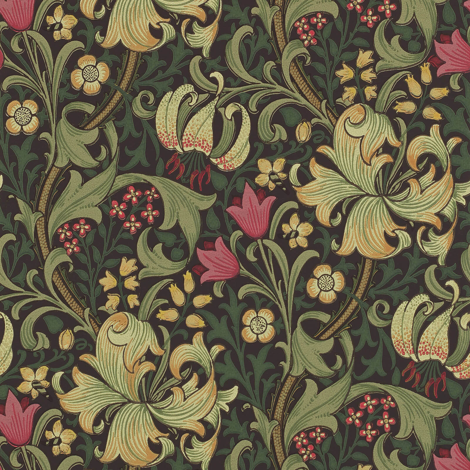
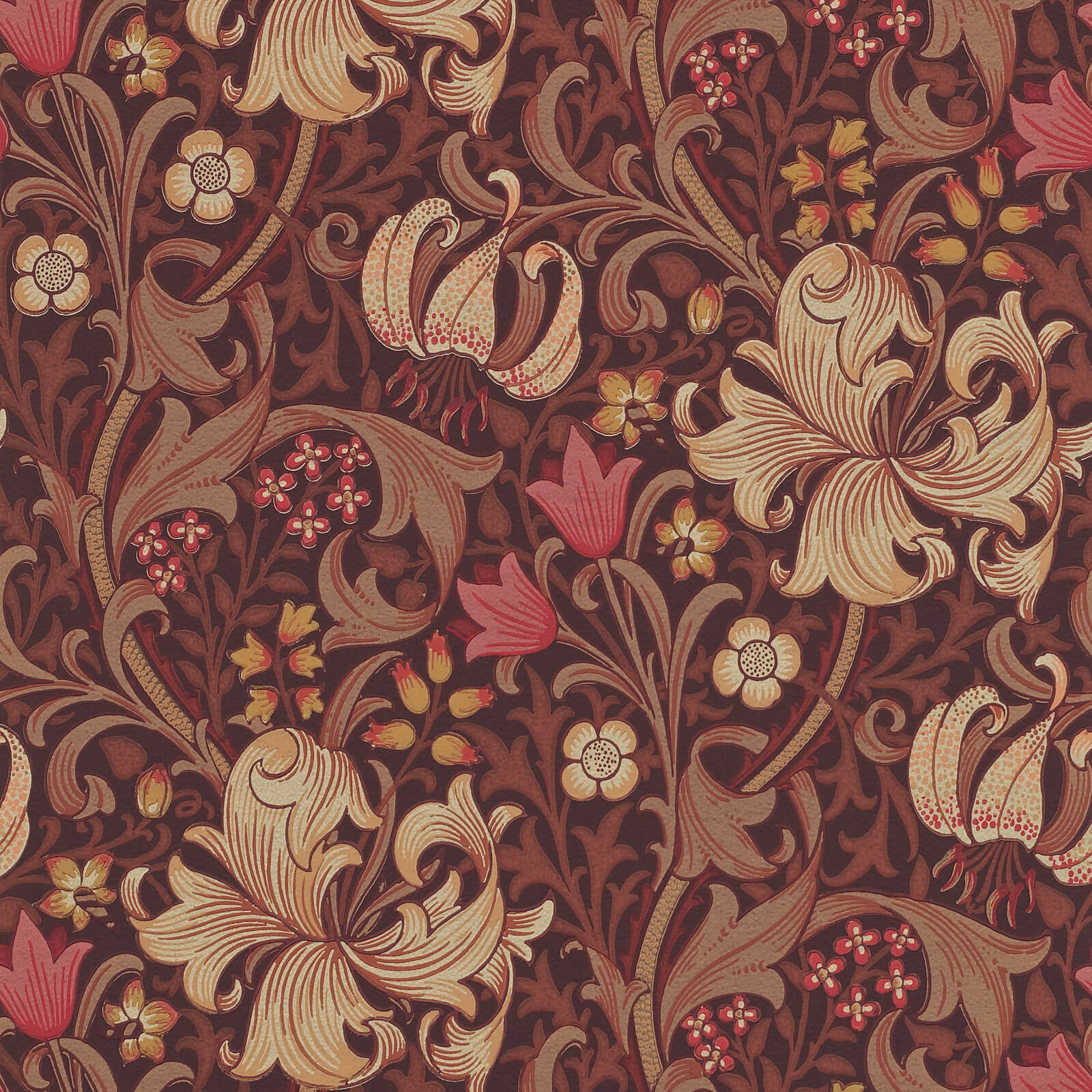
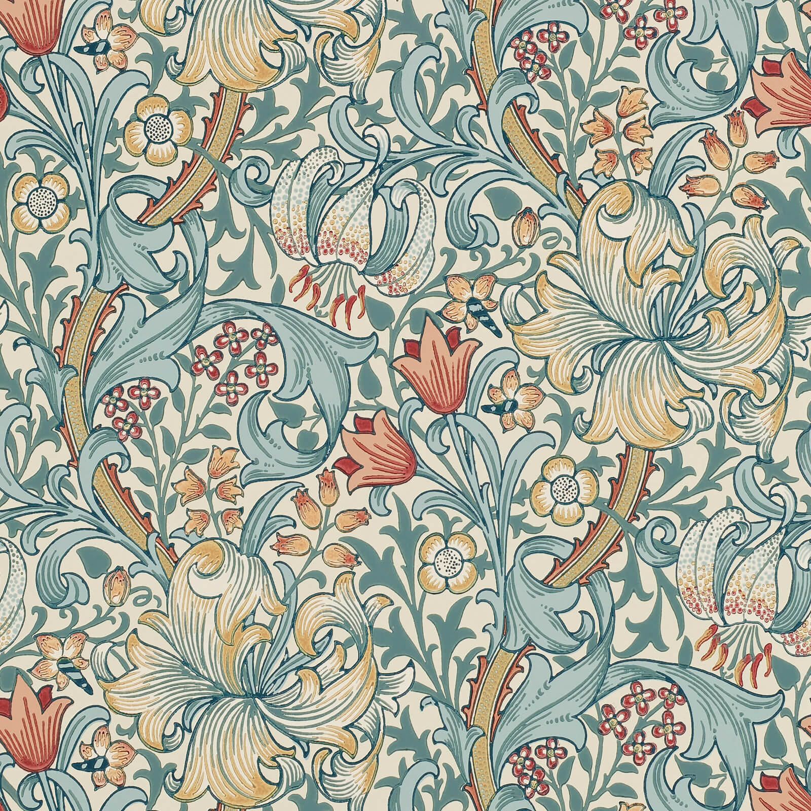
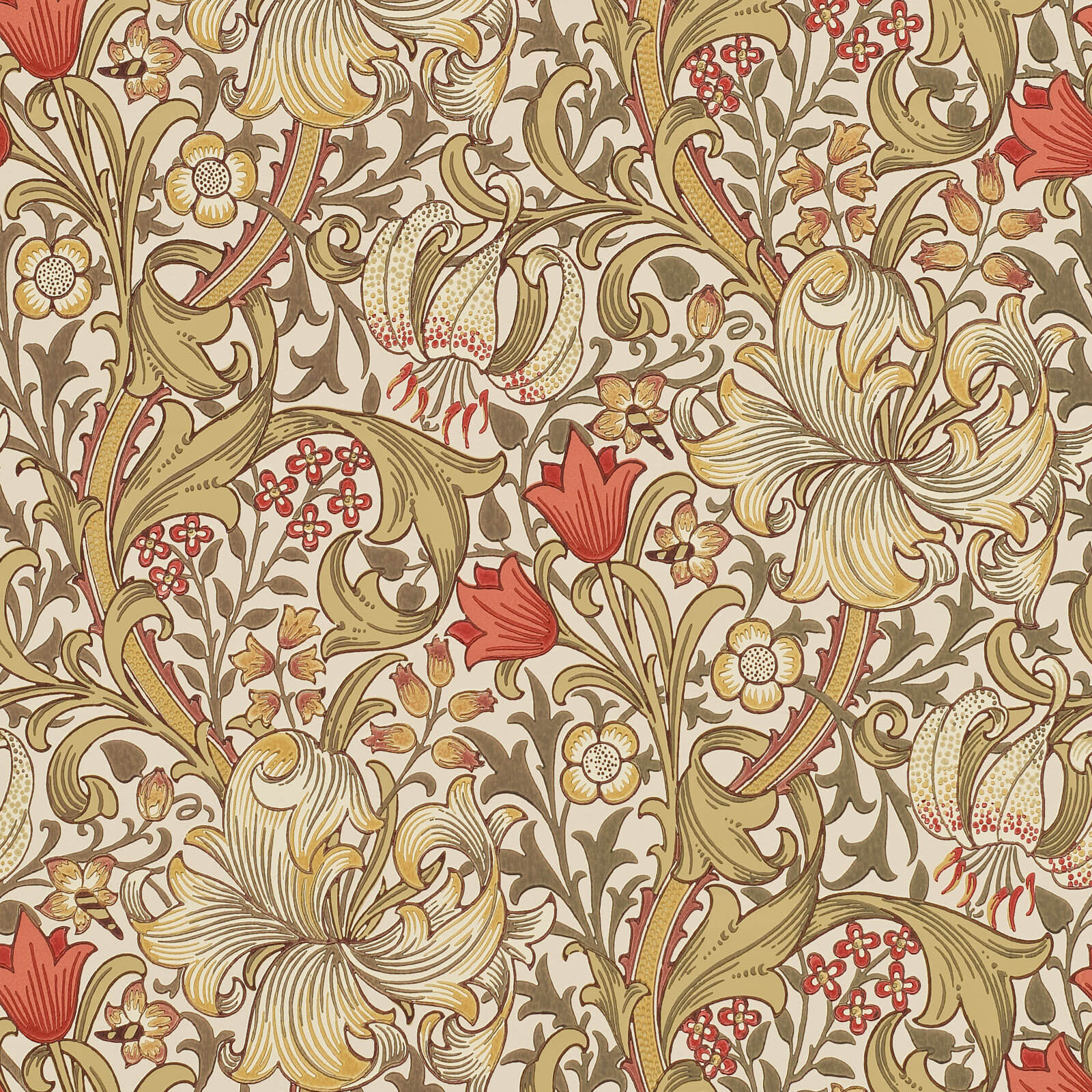
The Los Angeles look is not one style but a blend the city keeps returning to: warm neutrals borrowed from the canyons, the clean lines of midcentury architecture, and a little Spanish and Mediterranean warmth underneath. On walls that shows up as sandy grounds, terracotta and ochre accents, and organic patterns that feel drawn by hand rather than printed by machine.
The throughline is restraint with one moment of personality. A Los Angeles room rarely covers every wall. It picks a single surface, a dining nook or a bedroom behind the bed, and lets that one gesture carry the whole room while everything else stays open and bright.
Designing for the light
Los Angeles gets long, strong, warm-leaning sun for most of the year, and that light changes how color reads. Cool grays that look sophisticated in a gray climate can turn flat and dull here, while warm whites, greens, and earth tones seem to glow. This is why so many local interiors lean into the warm end of the palette.
Sheen matters too. High-gloss finishes throw hard reflections in this much daylight, so matte and low-luster grounds, along with natural textures like grasscloth and plaster-look papers, tend to sit better. They absorb the light rather than bounce it, keeping a room easy on the eyes at 3 p.m.
Indoor-outdoor and the canyon palette
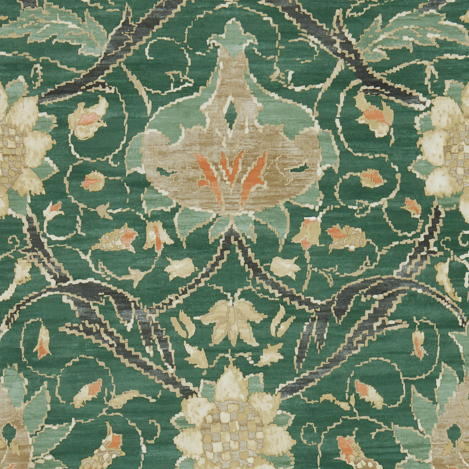
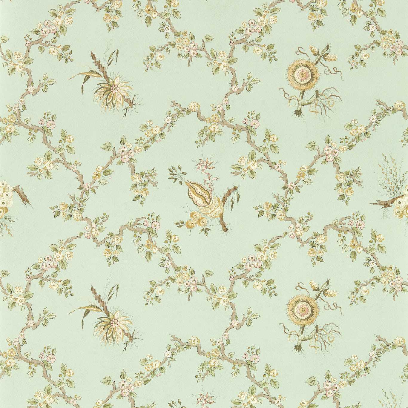
Because so much of local life happens with the doors open, walls are often chosen to carry the outside in. Botanical prints, palm and agave motifs, and soft desert tones let an interior wall rhyme with the garden or the hillside just beyond the glass. Done lightly, it feels native; done heavily, it tips into theme, so scale and color restraint keep it grown-up.
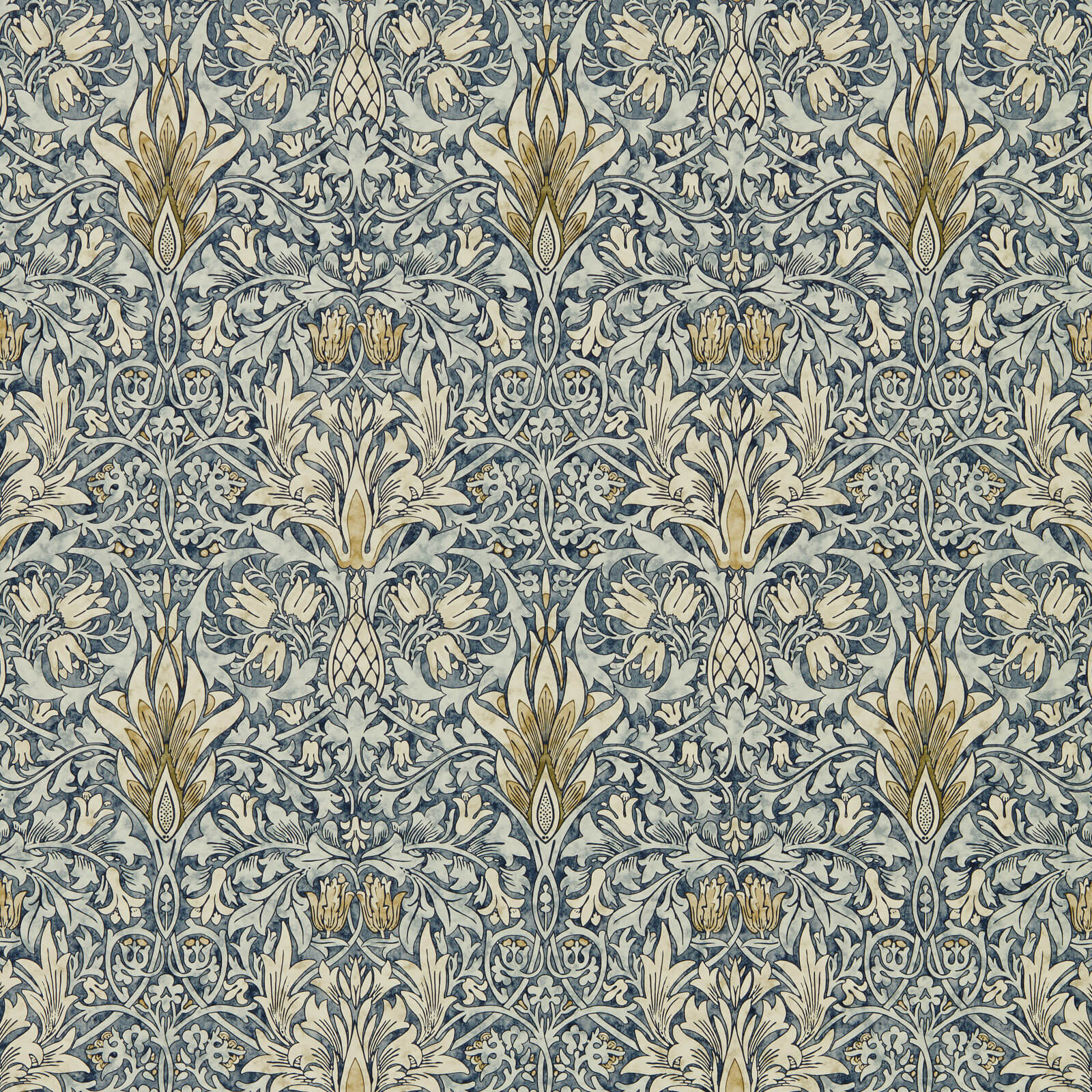
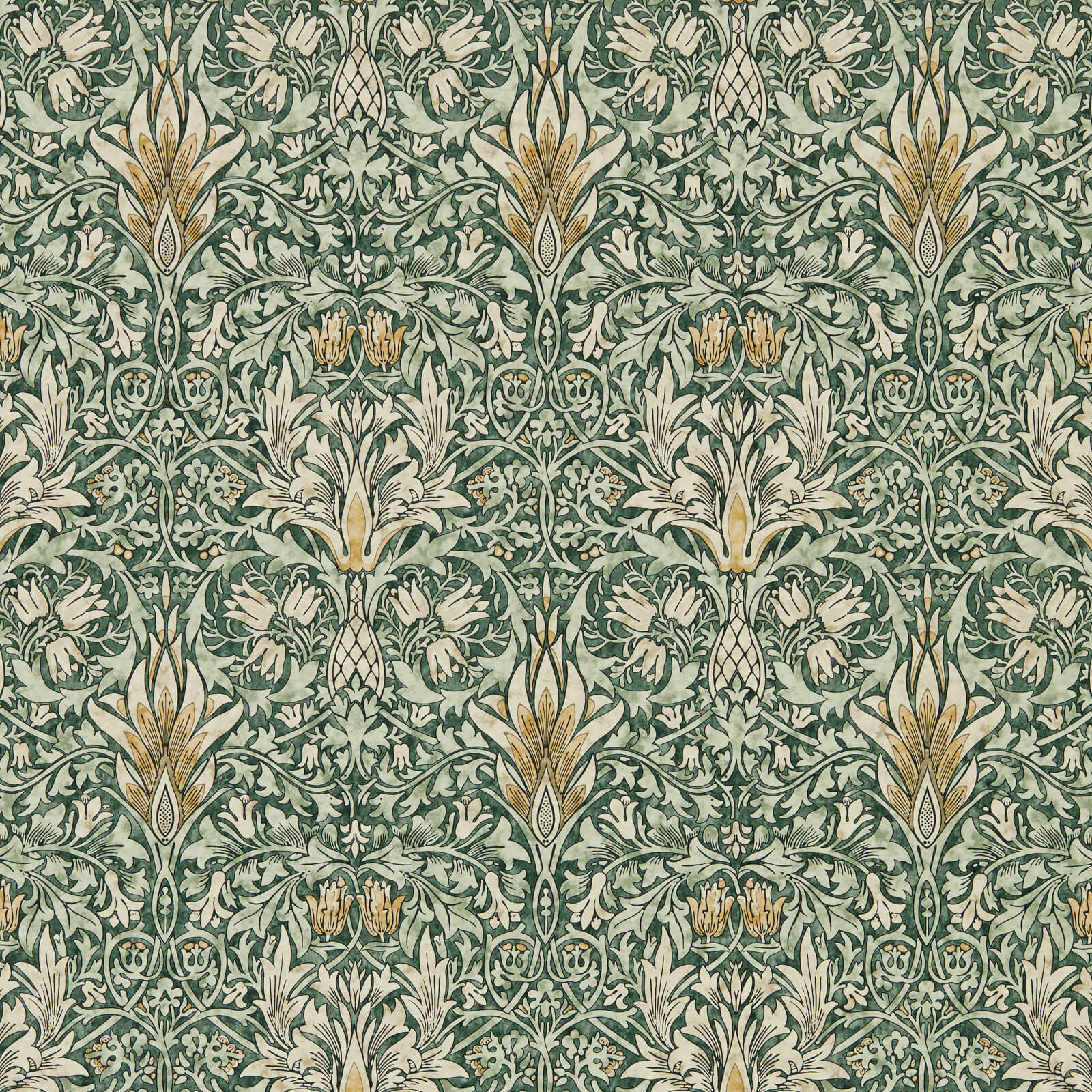
The canyon palette, dry greens, warm stone, faded blue, and bleached wood, is the safest place to start. Pull one of those tones for a feature wall and let the rest of the room stay pale and open, and you get the unforced Los Angeles feeling without trying too hard.
Quick checklist before you order
- Go warmFavor sandy, ochre, green, and terracotta tones that glow under strong LA sun instead of going flat.
- Kill the glareChoose matte or natural-texture grounds; high gloss throws hard reflections in bright daylight.
- One statement wallPick a single surface for pattern and keep the rest open so the room stays airy.
- Nod to outsideBotanical or desert motifs let an interior wall echo the garden or hillside beyond the glass.
- Test at 3 p.m.View samples in the harsh afternoon light this city is known for, not just morning.
Frequently asked
What colors work best in bright California light?
Warm whites, greens, ochres, and earth tones read best under strong warm sun, while cool grays tend to look flat and lifeless.
Is grasscloth a good fit for an LA home?
Very. Its natural texture absorbs harsh daylight and carries the relaxed, indoor-outdoor feeling the city's interiors are known for.
How do I get the LA look without it feeling like a theme?
Limit yourself to one statement wall and a restrained canyon palette; the ease comes from what you leave plain, not from covering everything.
Read more
- How an LA room actually gets specified: inside the Pacific Design CenterThe blue-and-green glass complex on Melrose is where a large share of Los Angeles's serious wallcovering decisions start, and it runs on trade rules a homeowner never sees.
- Hollywood Regency and the wall treatments that built the lookLacquer, oversized pattern, and studio-set glamour came out of a few named Los Angeles decorators working for the movie industry. Here is who they were and what they did to walls.
- Why Los Angeles rooms read as sun-washed, and the Case Study Houses that taught them toThe relaxed, light-flooded LA interior traces to a postwar architecture program run out of a magazine, and its logic still governs how the city treats a wall.
- Set decoration and the LA wall: what production designers know about pattern on cameraLos Angeles is a studio town, and its film craft has its own rules for wallcovering. What reads on a Burbank soundstage is not always what reads in a living room.
- Grasscloth, plaster, and the California organic-modern wallThe textured, tonal, natural-material wall is the default in much of today's Los Angeles design. Here is what the two workhorse materials actually are and how they behave.
- Beyond Paint: Defining Los Angeles Style Through Wallcoverings